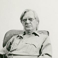
Nicholas Krushenick was an American abstract painter, collagist and printmaker whose mature artistic style straddled Pop Art, Op Art, Minimalism and Color Field. He was active in the New York art scene from the mid-1950s to the mid-1970s, before he began focusing his time as a professor at the University of Maryland. Initially experimenting with a more derivative Abstract Expressionist style, by the mid-1960s he had developed his own unique approach, painting increasingly decisive compositions marked by bold, colorful, geometric fields and forms simultaneously flattened and amplified by strong black outlines, in a style that eventually became known as Pop abstraction. In 1984, the biographical dictionary World Artists, 1950-1980 observed that Krushenick "has been called the only truly abstract Pop painter." Today, as other artists have been carefully folded into the same paradoxical genre, Krushenick is not only considered a singular figure within that style but also its pioneer, earning him the title "the father of Pop abstraction."
Born in New York City in 1929 into a working-class family, Krushenick dropped out of high school, served in World War II, worked on constructing the Major Deegan Expressway, and then enrolled in art school with the help of the GI Bill, attending the Art Students League of New York (1948–1950) and the Hans Hofmann School of Fine Art (1950–1951). In the early 1950s, Krushenick supported himself and his family by designing window displays for department stores and working for the Whitney and Metropolitan museums and the Museum of Modern Art.
From April 21 to May 10, 1956, Krushenick showed his work to the public for the first time during The Brothers Krushenick: Paintings - Glassprints - Collages, a joint exhibition with his older brother, John Krushenick, at the Camino Gallery co-op to which the pair belonged. Nicholas's first solo show, titled Nicholas Krushenick: Recent Paintings, debuted at the same gallery on January 25, 1957.
Later that year, having become frustrated with the internal politics of Camino, the brothers left and opened a framing shop in a nearby storefront, which quickly turned into the artists' cooperative Brata Gallery. Nicholas later recounted that it was John who devised the name, from the Russian "brata" meaning "brothers." Along with Camino and others, Brata became one of the now-famed 10th Street galleries, which nurtured and galvanized experimental artists by allowing them to sidestep the conservative uptown galleries that had dominated and, from a certain point of view, stifled the New York arts scene. With members including Al Held, Ronald Bladen, Ed Clark, Yayoi Kusama, and George Sugarman, Brata was "one of the most significant of the Tenth Street cooperatives which for a time were the most important launching pads for new artists." Nicholas exhibited solo shows at Brata in 1958 and 1960.
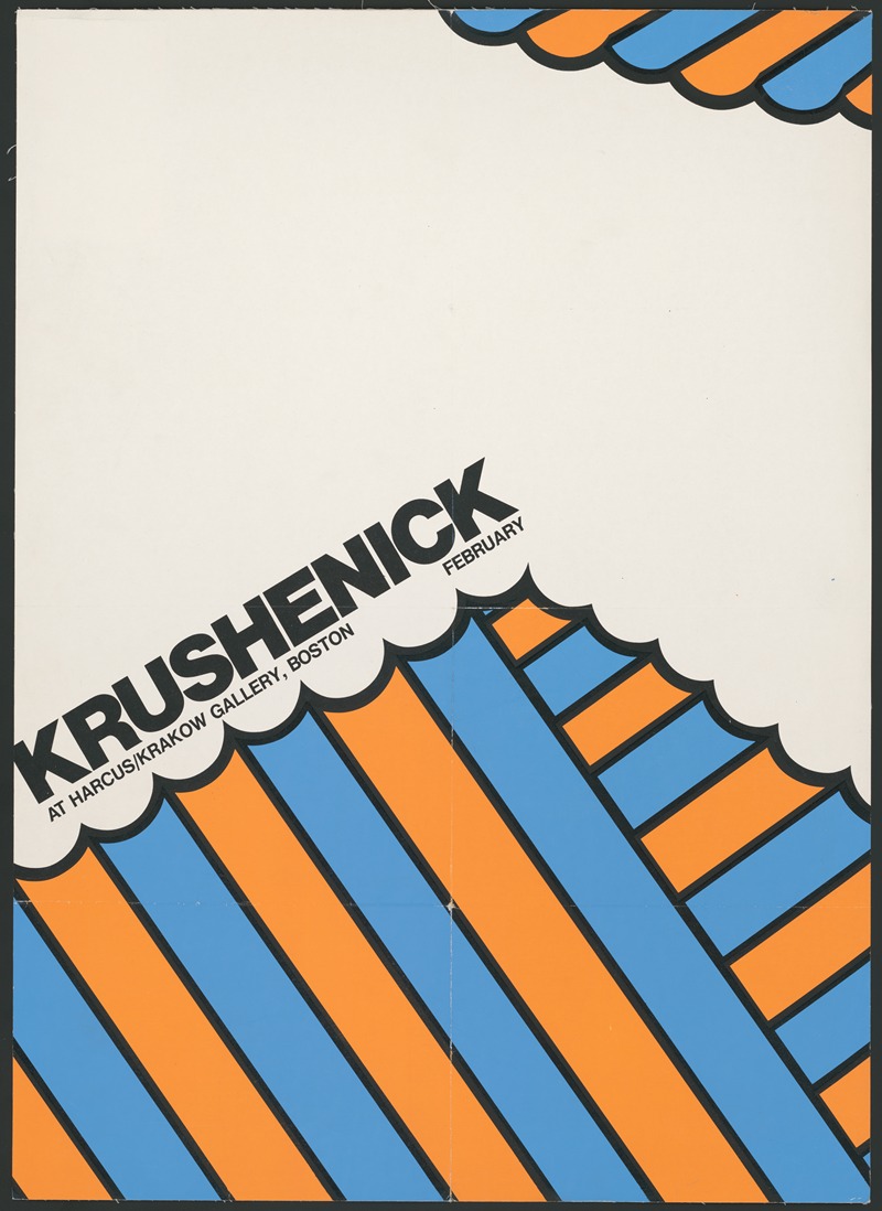
After leaving Brata in 1962, Krushenick gave solo shows at New York City's Graham Gallery in 1962 and 1964 and Fischbach Gallery in 1965. In 1966 came his first solo effort in Europe, at Galerie Müller in Stuttgart, Germany. In 1967, he gave solo shows in New York City and Paris as well as in Detroit, Michigan, and Vienna, Austria, while also receiving a fine arts fellowship from the John Simon Guggenheim Foundation. In 1968, the Center Opera Company of the Walker Art Center in Minneapolis, Minnesota, commissioned him to design the sets and costumes for a production of The Man in the Moon, held in conjunction with a large survey of his works at the Center. Solo exhibitions at Harcus-Krakow Gallery in Boston, Massachusetts, and Galerie Renée Ziegler in Zurich, Switzerland, soon followed. In 1969, on the heels of another solo at Pace Gallery, Krushenick was the Fall term Artist-In-Residence at Dartmouth College's Hopkins Center for the Arts, where he mentored students and created new works, culminating in an exhibition of paintings and prints at the college's Jaffe-Friede Gallery. Earlier that year, he had served as a visiting critic at Yale University, and in years past, he had accepted invitations to work as a visiting artist at the School of Visual Arts in New York, the University of Wisconsin in Madison, and others.
Along the way, Krushenick's work appeared in seminal midcentury group exhibitions at the Los Angeles County Museum of Art and the Art Gallery of Toronto in 1964; at New York's Whitney Museum of American Art and Museum of Modern Art, as well as Washington DC's Corcoran Gallery of Art, in 1965; at the Solomon R. Guggenheim Museum in 1966; and as part of the United States Pavilion at the 1967 World's Fair, a.k.a. Expo 67, held in Montreal, Canada. Despite finding acceptance at major institutions and inclusion among the most celebrated artists of the time, Krushenick viewed himself, with some satisfaction, as an outsider. As he told the curator and art historian Paul Cummings during an interview in 1968, critics and other observers have "never really pigeonholed me... Like I'm out in left field all by myself. And that's just where I want to stay."
Between his primary pursuit of painting and tertiary collage practice, Krushenick pursued a keen interest in printmaking. The companion book to Graphicstudio: Contemporary Art from the Collaborative Workshop at the University of South Florida, a 1991 exhibition at the National Gallery of Art, notes that "Krushenick began to experiment with screenprinting in the late 1950s and became an active printmaker by the mid-1960s," including during a 1965 fellowship at the Tamarind Lithography Workshop in Los Angeles (which has since moved to Albuquerque, New Mexico, and been rebranded as the Tamarind Institute). At Tamarind, "he completed twenty-two lithographs during his two-month tenure," which, still featuring the more organic and undulating forms that marked Krushenick's earliest mature paintings, can be viewed here. In 1967, working with the famed Domberger serigraphy studio, the artist produced his R3-67 portfolio, a suite of a dozen screenprints that, taking advantage of serigraphy's capacity for bright color, are significantly more vibrant and yet refined compared to the Tamarind suite and track Krushenick's broader shift toward clean, consistent line execution. The following year, published by Pace Editions and produced at Domberger, Krushenick produced his Iron Butterfly portfolio, a suite of 10 similarly vivid and composed screenprints, half of which can be viewed here. In 1970 at Graphicstudio, Krushenick briefly returned to lithography, producing works embracing straight lines and angular, "more architectonic" forms. In his 1971 Fire-Flash-Five-Fade suite of six serigraphs, Krushenick compresses and sharpens his trademark black lines into jagged bolts of electricity or shark's teeth.
In the mid-1970s, Krushenick began spiritually withdrawing from the New York art scene from which he'd already physically departed. He then embarked, after many visiting stints at various institutions during the prior decade, on his only long-term engagement as an educator, serving as a professor at the University of Maryland, College Park from 1977 to 1991. Though he never stopped producing new paintings, his prominence in the New York and global art scenes faded away over time. But he still had champions, including the New York-based outsider curator Mitchell Algus and his Mitchell Algus Gallery, which held two exhibitions of Krushenick's work, in 1997 and in 1999. The latter occurred after Krushenick died of liver cancer in New York on February 5, 1999, at age 69. As of 2021, at least ten posthumous solo exhibitions have helped spur renewed interest in Krushenick's work and legacy. Two of those exhibitions—at Gary Snyder Gallery in New York and the Frances Young Tang Teaching Museum and Art Gallery at Skidmore College, respectively—prompted major literary treatments: John Yau's Nicholas Krushenick: A Survey (2011) and Ian Berry's Nicholas Krushenick: Electric Soup (2016).
Krushenick was part of a generation that at first emulated and soon rebelled against Abstract Expressionism, the dominant painting movement in post-war America. This rebellion would eventually drive that style out of fashion, leading to numerous simultaneous movements that continue to interest artists, critics, historians and collectors today. Krushenick landed somewhere between them all, both embracing and rejecting elements of many styles considered distinct, including Pop Art, Op Art, Minimalism, and Color Field. Some of his early inspirations were Henri Matisse, J. M. W. Turner, Henri Rousseau, Fernand Léger, Alexander Calder, Claes Oldenburg and his eventual friend Roy Lichtenstein.
In 1956, when he gave his first public showing in a group exhibition, Krushenick's paintings were muddy and imprecise. Yet he was already starting to poise discernible shapes and masses next to each other in a manner that one critic seems to have misinterpreted as a "Cubist persuasion." Not a year later, on the occasion of his first solo show in 1957, another critic resisted the temptation to classify the work, content to observe Krushenick's "methodically painted strands or streamers which, varying from canvas to canvas in color, width and tensility, advance upon a rival host with similar properties or thrustingly explore an open space or solid color. The mutations on view are dramatically potent, flamboyantly so in the large canvases where black stalactites prong downward into yellow, or black fingers undulate from the bottom."
In 1959, Krushenick discarded what he called the "dirty kitchen" look of oil paints and replaced it with the "delicious" electricity of Liquitex acrylics, which had just become commercially available. Having an immediate effect on the brightness and saturation of his paintings as well as the precision with which he could render them, this could be considered the pivotal moment of Krushenick's career. Following this change, his paintings start to feature clear black lines framing both the painting itself and the individual forms within it, albeit via a wobblier, curvier, messier approach than the more precise compositions to come.
In 1965, one art critic, Vivien Raynor, observed that Krushenick "is now beginning to look Pop. Whether this is because he anticipated the movement and now looks more official, or because he's using acrylic colors, or simply because everyone to an extent becomes a victim of the audience's compulsion to organize artists into groups, I can't tell." Yet it is important to note that only his palette resembled Pop art. His subject matter made no references to pop culture; indeed, it made no overt reference to recognizable objects at all. However, his increasingly monumental works did find inspiration in cartoon illustration, and many critics interpreted the subject matter as more or less covertly sexual—often as vulvar and penetrative.
By this time, Krushenick had begun to home in on a more exacting style, obscuring the visibility of the artist's hand. At first he did this with the aid of extensive drawings that became like maquettes for the painting. Over time, these drawings would become less precise and, instead, he'd rely on using tape directly on the canvas surface. By 1967, his style had become noticeably tighter, without losing its emotionality. As John Perreault observed in a feature story that year, "In spite of the hard black, coloring-book lines that divide one shape or super-color from another, the neat flatness, and the often symmetrical composition, these paintings are systematic visual manifestations of the emotionally organic, executed with cool precision, but conceived with great gusto. The raucous candy-cane stripes that Krushenick uses as the basic device of his abstractions do not 'contain' the painting." To correct Perreault on one point, Krushenick's paintings are rarely if ever symmetrical, though, in some cases, it's an easy mistake to make.
In the mid-1970s, when Krushenick began to withdraw from the New York art world and his vision began to falter, he turned his focus towards education. But his painting continued. By this time, his style had evolved quite a bit. Long gone were the feathery, curvilinear forms of the mid-1960s. Now the implicit and explicit form of the grid took precedence on his canvases, almost like a prescient depiction of the boom in technology that would soon arrive. As Corinne Robins noted in 1975, "The new paintings, like the old, have a tonal feeling; but now, rather than the blare of trumpets, the buzz of an IBM machine making crazy computations comes to mind." Into the 1980s, his paintings would retreat in precision as well as in color, marked by flurries of cartoonish, confetti-like ribbons amid cool grays, blues and pinks. By the end of that decade and the start of a new one, yellow began to dominate Krushenick's work, with a renewed attention to intricate details playing out across smaller canvases. From the early 1960s to the late 1990s, perhaps the one through line is the black lines themselves, delineating Krushenick's forms while uniting his works.
